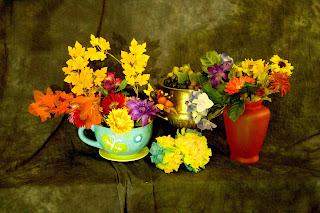
1) It was setup this was to give a cultural feeling with the first image and for the last two it was in a way where the colors would blend together nicely.
2) The lighting was directly placed onto the object which actually came out pretty good as it kind of bounced off onto the others.
3) The adjustments used were hue and saturation change, sharpening of the image, levels, and oil painting,.
4) It could be improved in a lot of ways, but I feel like a background change would do justice because as I was doing the color splash watching the tutorial, the way the flower harmonized with it's background was really good.


